

In 2025, developing a website that performs well in search results necessitates striking a delicate balance between technical SEO considerations and visual design components. The days of having to decide between a website that is visually appealing and one that ranks highly in search results are long gone. The creation of websites that satisfy search engine algorithms and users is the main goal of today’s best practices.
What is SEO-Friendly Web Design?
The process of designing websites that offer a great user experience and are completely accessible and indexable by search engines is known as SEO-friendly web design. It involves planning your website from the ground up with both users and search engines in mind.
As Shopify describes it: “When put together, SEO web design is the design and creation of a website that is optimized for both search engines and humans.” Shopify
Why SEO-Friendly Web Design Matters in 2025
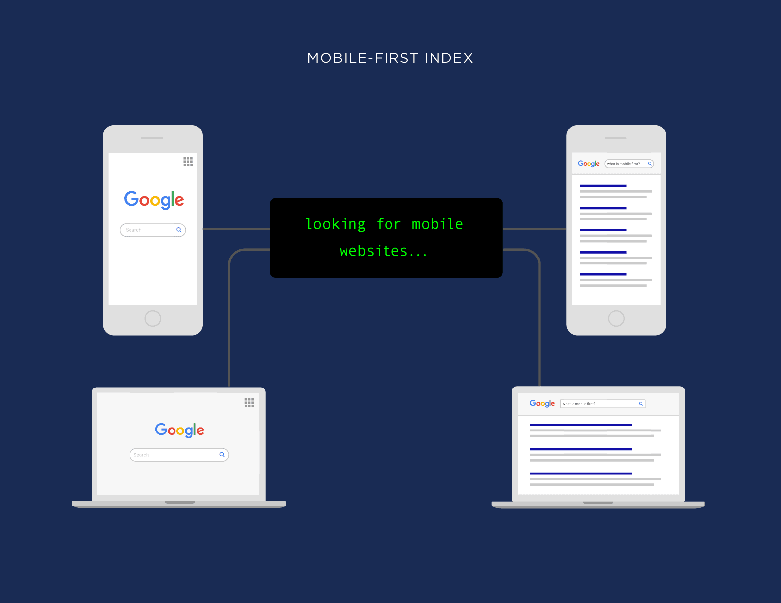
1. Mobile-First Indexing Continues to Dominate
Google uses mobile-first indexing, meaning it primarily uses the mobile version of your website for ranking and indexing. With over 95.9% of people accessing the internet from mobile devices in 2025, having a mobile-optimized website is no longer optional.
2. Core Web Vitals Impact Rankings
Google’s Core Web Vitals have become increasingly important ranking factors. These metrics measure loading performance, interactivity, and visual stability:
- Largest Contentful Paint (LCP): Measures loading speed
- Interaction to Next Paint (INP): Measures interactivity
- Cumulative Layout Shift (CLS): Measures visual stability
Sites that perform well on these metrics not only rank better but also provide a better user experience.
3. AI Integration in Search Results
In 2025, AI plays a significant role in how search engines understand and rank content. According to SEO trends for 2025, “AI Overviews and search integrations continue to expand,” requiring websites to be structured in ways that AI systems can easily parse and understand. WordStream
4. Increased Focus on E-E-A-T
Google’s E-E-A-T (Experience, Expertise, Authoritativeness, and Trustworthiness) guidelines have expanded to include “Experience” as a key factor. Websites that demonstrate first-hand experience with their subject matter along with proven expertise tend to rank higher.
10 Essential Elements of SEO-Friendly Web Design
1. Responsive, Mobile-First Design
Mobile optimization is no longer just a recommendation – it’s essential. A responsive website automatically adjusts to various screen sizes and devices, ensuring a seamless user experience across desktop, tablet, and mobile.
Best practices include:
- Implementing responsive design that adapts to any screen size
- Creating touch-friendly navigation menus and buttons
- Using appropriate font sizes (around 16px for body content)
- Ensuring all elements are accessible on smaller screens
Fashion Nova’s website demonstrates effective mobile optimization with a clean layout that transforms seamlessly between desktop and mobile views.
2. Fast Loading Speed
To improve page speed:
- Optimize image sizes and formats
- Implement browser caching
- Minimize HTTP requests
- Use content delivery networks (CDNs)
- Reduce server response time
- Eliminate unnecessary plugins and scripts
Use tools like Google’s PageSpeed Insights to measure and monitor your website’s performance.
3. Clean Site Architecture & Navigation
Key elements of good site architecture include:
- Clear navigation menus
- Logical content categorization
- Breadcrumb navigation for user orientation
- URL structure that reflects site hierarchy
- No page should be more than 3-4 clicks from the homepage
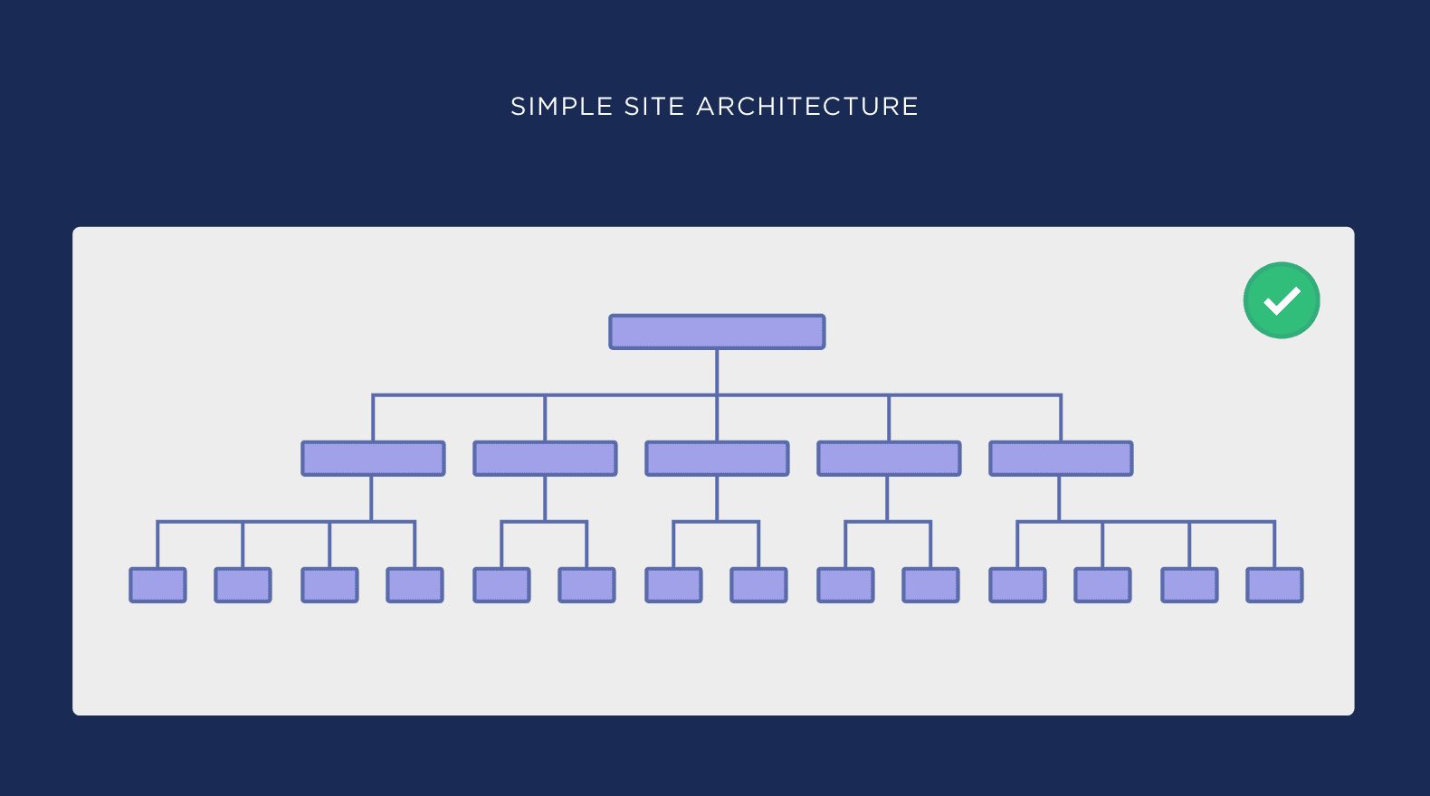 A simple site architecture makes it easier for both users and search engines to navigate your website Backlinko
4. Optimized Content Structure
Well-structured content is easier for both users and search engines to understand. This includes:
- Clear Headings: Use H1, H2, H3 tags in a hierarchical manner to organize content
- Short Paragraphs: Break up text for improved readability
- Bullet Points and Lists: Make content scannable
- Visual Content: Include relevant images, videos, and infographics
- Internal Links: Connect related content throughout your site
John Mueller from Google emphasizes: “We use headings to better understand the content on the page… The better you make these headings, the more likely we are to properly understand what the content is about.” Backlinko
5. Image Optimization
Properly optimized images contribute to both better user experience and improved SEO:
- Descriptive File Names: Use descriptive, keyword-rich filenames (e.g., “seo-friendly-web-design.jpg”)
- Alt Text: Add complete, descriptive alt attributes for all images
- Image Compression: Optimize file sizes without sacrificing quality
- Responsive Images: Ensure images adapt to different screen sizes
- Proper Formatting: Use appropriate image formats (WebP, JPEG, PNG)
6. HTTPS Implementation
Secure connections are now standard for all websites. Using HTTPS:
- Creates a secure connection between the user’s browser and your server
- Displays a padlock icon in the address bar, building trust
- Serves as a lightweight ranking factor for Google
- Protects user data during transactions and form submissions
7. Clean URL Structure
Good URL structure practices include:
- Keep URLs short and descriptive
- Include relevant keywords
- Use hyphens to separate words
- Avoid unnecessary parameters or session IDs
- Maintain a logical hierarchy (example.com/category/subcategory/page)
8. Schema Markup Implementation
Schema markup (structured data) helps search engines better understand your content and can result in rich snippets in search results:
Popular schema types include:
- Organization
- LocalBusiness
- Product
- Article
- Recipe
- FAQ
- Review
9. Mobile-Friendly Forms and CTAs
Forms and call-to-action buttons must be easy to use on all devices:
- Create large, touch-friendly buttons
- Keep forms short and simple
- Use appropriate input types (email, phone, etc.)
- Implement autofill where possible
- Include clear error messages and validation
10. Web Accessibility
In 2025, web accessibility isn’t just good practice—it’s essential for reaching all users and improving SEO:
- Provide alt text for images
- Use proper heading structure
- Ensure sufficient color contrast
- Make all functionality available via keyboard
- Add captions for audio and video content
- Support screen readers and assistive technologies
Latest SEO Web Design Trends for 2025
1. AI-Driven Personalization
AI is being used to create personalized user experiences based on visitor behavior, preferences, and demographic data. This improves engagement metrics like time on site and reduces bounce rates—both positive signals for SEO.
2. Voice Search Optimization
With voice assistants continuing to grow in popularity, optimizing for voice search remains important in 2025. This means:
- Using natural language in content
- Optimizing for question-based queries
- Creating FAQ sections that address common questions
- Focusing on conversational long-tail keywords
3. Core Web Vitals Optimization
Google’s Core Web Vitals continue to be prominent ranking factors. The latest emphasis is on INP (Interaction to Next Paint), which measures how quickly your website responds to user interactions.
4. Brutalist Web Design with Purpose
According to TheeDigital, “2025 web design trends are swinging dramatically, with a notable resurgence of brutalist principles for the modern web. Characterized with bold typography, simple layouts, and unpolished elements, this trend pushes back against years of polished, template-driven design.” TheeDigital
These designs can be SEO-friendly when they maintain clean code and good user experience despite their minimalist aesthetic.
5. Enhanced E-E-A-T Signals
Websites are focusing more on demonstrating Experience, Expertise, Authoritativeness, and Trustworthiness through:
- Author bios and credentials
- Citations and references
- User-generated reviews and testimonials
- Clear contact information and about pages
- Secure transactions and privacy policies
Common SEO Web Design Mistakes to Avoid
- Prioritizing aesthetics over functionality: While visual appeal is important, it shouldn’t compromise site speed or usability.
- Ignoring mobile optimization: With mobile-first indexing, a site that doesn’t work well on mobile devices will struggle to rank well.
- Complex navigation: If users can’t easily find what they’re looking for, they’ll leave—and so will search engines.
- Hidden content: Content that’s only visible after user interaction (click-to-expand, tabs, etc.) may not be properly indexed.
- Missing or improper meta tags: Title tags and meta descriptions are still crucial for communicating page content to search engines.
- Duplicate content: Without proper canonical tags, similar pages may compete against each other in search results.
- Blocking search engine access: Improper use of robots.txt or noindex tags can prevent search engines from indexing your content.
- Poor internal linking: Without strategic internal links, important pages may not receive enough visibility or authority.
Tools to Measure Your SEO-Friendly Design
- Google PageSpeed Insights: Analyzes your site’s speed and provides recommendations for improvement.
- Google Search Console: Monitors your site’s performance in search results and identifies indexing issues.
- Google Mobile-Friendly Test: Checks if your site works well on mobile devices.
- Screaming Frog: Crawls your website to identify SEO issues, broken links, and more.
- Semrush Site Audit: Provides comprehensive SEO analysis with actionable recommendations.
Creating an SEO-Friendly Web Design Strategy
The key to successful SEO web design in 2025 is bridging the gap between web development and SEO from the very beginning. Here’s a step-by-step approach:
- Start with keyword research: Understand what your target audience is searching for before designing your site structure.
- Create a logical site architecture: Organize your content in a way that makes sense to both users and search engines.
- Design with mobile in mind: Use a mobile-first approach to ensure your site works well on all devices.
- Optimize for speed: Implement best practices for fast loading times from the beginning.
- Focus on user experience: Create intuitive navigation and readable content that keeps users engaged.
- Implement technical SEO elements: Add schema markup, proper meta tags, and other technical optimizations.
- Monitor and adjust: Use analytics to track performance and make continuous improvements.
Conclusion
In 2025, SEO-friendly web design is about creating websites that serve both users and search engines effectively. By implementing the best practices outlined in this guide, you’ll create a site that not only looks great but also ranks well in search results, driving more organic traffic and potential customers to your business.
Remember that SEO is an ongoing process, not a one-time implementation. Continue to monitor your site’s performance, stay updated on search engine algorithm changes, and make adjustments as needed to maintain and improve your rankings over time.