
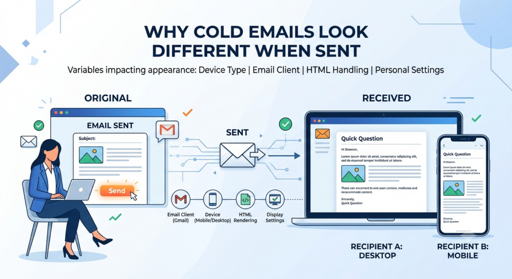
Here’s something that trips up almost everyone running cold email at volume. You write an email, it looks clean in the editor, good spacing, right font, nothing weird.
Then you send a test to yourself and suddenly the font has changed, a random sentence is bold, and the whole thing looks like it was put together by someone who doesn’t care.
You didn’t do anything wrong. The problem is that your editor and your recipient’s inbox are running on completely different rendering engines, and they don’t agree on what your email is supposed to look like.
This matters beyond aesthetics.
Formatting problems hurt deliverability, tank reply rates, and undermine the credibility of every word you wrote. The good news is the fix is simpler than most people expect, and once you understand why it happens, you stop fighting it and just work around it.
Why the Editor and the Inbox Show Different Things
When you write an email inside Smartlead or any web-based platform, you’re working inside a browser.
The browser renders everything cleanly, supports custom fonts, handles spacing correctly, does what you’d expect. The problem starts when that email travels to someone’s inbox.
Gmail renders HTML differently from Outlook. Outlook on desktop uses a completely different engine than Outlook in a browser.
Apple Mail does its own thing. This is called the email client rendering problem, and it’s been the biggest consistency issue in email design for over a decade. Each client interprets your email’s code in its own way, and none of them are obligated to show the same result your editor did.
The classic example is Outlook’s Word rendering engine. Older versions of Outlook use Microsoft Word to display HTML emails, which was never designed for email. It strips out CSS properties that every browser supports without question. So what looks perfect in Gmail can look completely broken in Outlook, even when the underlying code is technically correct.
2025 and 2026 made this worse, not better, because Microsoft is mid-migration between the old Word-based Outlook and a new Chromium-based version.
Depending on which version your recipient is running, they’re getting a completely different rendering experience.
You can’t control which one they have, and you can’t write code that makes both look identical without significant workarounds that aren’t practical for cold email.
The safest response to a problem you can’t control is to remove it as a variable entirely. Plain text has no rendering engine to fight. But more on that in a moment.
The Email Safe Fonts Problem
The most common version of the rendering problem shows up as a font change.
You write in one font, the recipient sees a different one. This happens because the font you chose isn’t installed on their machine or supported by their email client, and there’s no enforcement mechanism that forces email clients to load external fonts the way browsers do.
Web-safe fonts like Arial, Georgia, Verdana, Times New Roman, and Helvetica render reliably everywhere because they’re built into the operating system itself.
They’re on every Windows machine, every Mac, every Android and iOS device. Google Fonts, custom brand fonts, or anything outside that safe list have unpredictable rendering across email clients.
When the client sees a font it doesn’t recognize or can’t load, it substitutes its own default, and your carefully chosen typography disappears with no warning.
Here is the full list of email-safe fonts you can rely on across all major clients:
Arial, Helvetica, Verdana, Tahoma, Trebuchet MS, Times New Roman, Georgia, Garamond, Courier New, Brush Script MT.
If you use a Google Font anywhere in your template, always define a fallback. Specifying Arial or Helvetica as the second option in your font stack means the email degrades gracefully rather than substituting whatever the client feels like using that day.
The Hidden HTML From Copy-Paste
This one catches people constantly, and it has nothing to do with your email editor itself.
You write copy in Google Docs, Notion, or even a ChatGPT conversation, then paste it into your email editor. The text looks fine. But hidden inside that paste is formatting code from the original source: HTML tags for bold text, paragraph styles, line-height definitions, and font specifications that override your template’s styling completely.
The result is random bold text appearing mid-sentence, inconsistent line spacing, or sections that render in a completely different style from the rest of the email. You didn’t add any of that formatting intentionally, but it traveled with the paste. This is one of the most common causes of the “why does my cold email look different” problem, and it has nothing to do with your sending platform or infrastructure.
The fix is to always paste using Shift + Paste (or Cmd + Shift + V on Mac), which strips all formatting before anything enters the editor.
If something already looks off in your current draft, delete the affected text entirely and retype it from scratch rather than trying to reformat it.
Reformatting over hidden HTML rarely clears it completely because the underlying tags are still in the source code even when they’re invisible.
Why This Matters for Email Preview Text
One thing most guides miss: formatting problems don’t just affect how your email looks when it’s open. They affect the email preview text your recipient sees before they ever click.
The first sentence of your email renders as preview text in Gmail and most mobile clients, sitting right next to your subject line in the inbox view.
If that sentence contains broken formatting artifacts, rogue HTML characters, or inconsistent styling, those elements show up in the preview. That’s the first impression your prospect gets, and it’s happening before they’ve even decided whether to open.
This is why the opening line matters on two levels simultaneously: it has to earn the open, and it has to display cleanly in the inbox preview.
If your first line reads like garbled code or has unexpected symbols, the open never happens regardless of how good your subject line is. Keeping the opening sentence in plain text with no special characters protects both the preview and the read.
How Formatting and Spintax Work Together
This is where most guides stop, and it’s where most people leave significant performance on the table.
Formatting isn’t just about fonts and bold text. It’s also about whether your email looks identical to the 499 other emails you sent in that campaign.
Gmail and Outlook both fingerprint bulk sends.
When they see the same message body arriving from the same sender infrastructure going to hundreds of recipients, they classify it as bulk mail. That classification is what pushes you out of the primary inbox and into promotions or spam.
Spintax is the mechanism that breaks that fingerprint. It’s a simple formatting system where you write alternatives inside curly braces separated by pipe characters, and your sending platform picks a different combination for each recipient.
The basic syntax looks like this:
{Hi|Hey|Hello} {first_name},
That single line produces three different greetings. Scale that across every sentence in your email and you go from one message to hundreds of genuinely unique versions without writing each one by hand. The full spintax guide covers the mechanics in detail, but the connection to formatting is worth spelling out here.
Why Spintax Is a Formatting Decision, Not Just a Personalization One
Most people think of spintax as a personalization tool. It is, but it’s equally a formatting and deliverability tool. Here’s why that distinction matters.
Spam filters don’t just look at subject lines. They analyze body text, sentence structure, paragraph patterns, and message fingerprints. When 500 people receive the exact same email body, spam filters notice.
The duplicate content signal is one of the strongest bulk-send indicators that exists.
Spintax changes the content fingerprint of every single email before it leaves your sending infrastructure.
Each recipient gets a technically different message, even if the meaning and intent are identical.
That’s the deliverability benefit. It’s not about tricking anyone. It’s about making your campaign behave more like 500 individual conversations than one broadcast.
What Good Spintax Looks Like in a Plain Text Email
The interaction between spintax and plain text is important to understand.
Spintax runs at the infrastructure layer, meaning Smartlead resolves all your {option A|option B} variations into plain readable text before the email is sent. The recipient never sees curly braces, pipes, or any formatting syntax. They just get a clean, normal-looking message.
This means you get the full deliverability benefit of spintax and the full deliverability benefit of plain text simultaneously. They don’t conflict. They stack.
Here’s what a plain text email with spintax actually looks like in your editor:
{Hi|Hey|Hello} {first_name},
{I noticed|I came across|I saw} that {company} {is hiring for|recently posted about|has been growing in} {role_area}.
{We've helped|We work with|Our team supports} {similar companies|teams like yours|{industry} businesses} {who deal with|facing|that struggle with} {pain_point}.
{Curious if|Would love to know if|Quick question:} {this is on your radar|you're thinking about this|this resonates with you}.
{Happy to|Would love to|I'd be glad to} {share a quick breakdown|walk you through what we've seen work|send over a short case study}.
{Best|Cheers|Talk soon},
{sender_name}
That template generates hundreds of unique combinations. Every recipient gets something that reads like it was written directly to them. And because it resolves to plain text at send time, there’s no font conflict, no rendering inconsistency across email clients, and no HTML weight triggering spam filters.
Where to Use Spintax in Your Email
The biggest mistake with spintax is only using it in the greeting.
Swapping “Hi” for “Hey” changes about three characters out of a 150-word email. That’s not enough variation to meaningfully affect the content fingerprint.
What actually works is spinning at the section level, not the word level.
Each of these elements should have its own spintax group:
The greeting line, the opening observation or personalization hook, the problem or situation you’re addressing, the social proof or credibility statement, and the call to action. That’s five variation points. If each has three options, you have 3 to the power of 5, which is 243 unique email combinations from a single template.
Subject lines deserve spintax too.
Three variations using lowercase, conversational phrasing consistently outperforms a single subject line because it gives you A/B testing data automatically while also varying the fingerprint across your send list.
Spintax and Follow-Up Sequences
This is where spintax becomes genuinely powerful and where most people don’t take it far enough.
Each email in your follow-up sequence should have its own independent spintax, not just the first touch. If your Day 1 email, Day 3 follow-up, and Day 7 breakup email all resolve to plain text with varied content, the whole thread looks like an authentic human conversation rather than an automated sequence.
When a prospect sees your second or third email and it reads slightly differently from the first, that’s a signal that a real person is following up.
That’s exactly the impression you want. The cold email sales cadence guide has more on how to structure sequences so each step builds on the last without feeling repetitive.
You can also use Smartlead’s subsequence feature to branch based on reply behavior.
When someone responds positively to the first touch, they move into a different track entirely with its own spintax variations. When someone gives a soft “not right now,” a re-engagement subsequence fires at the right interval.
The content fingerprint stays varied throughout, which keeps deliverability high across the whole campaign lifecycle.
How Email Formatting Affects Deliverability
The formatting problem isn’t just visual. It connects directly to whether your email lands in the primary inbox or gets routed to promotions or spam.
Every HTML element you add to an email makes it look more like a bulk marketing message to spam filters.
Custom fonts require external font-loading requests. Bold and italic styling add HTML tags. Tracked links add redirect layers. All of these are signals that spam filters use when categorizing your email.
The Smartlead email deliverability guide covers the technical side in detail, including how content formatting interacts with SPF, DKIM, sender reputation, and inbox placement rates.
A clean, unformatted email isn’t just easier to write. It actively performs better. Sending cold emails in plain text with no images and minimal formatting is one of the highest-leverage deliverability improvements you can make without touching your sending infrastructure at all.
Your email signature is another place where formatting quietly hurts you. Image-heavy signatures with logos, social icons, and HTML tables add weight and introduce HTML elements that spam filters flag.
One outbound agency reported inbox placement jumping from 72% to 91% after removing a logo from their signature.
The words in the signature didn’t change. Just the image weight. The cold email sign-off guidecovers how to structure signatures so they don’t undermine an otherwise clean send.
Why Formatting Kills Reply Rates Before Your Copy Gets a Chance
A broken or over-formatted email reads like it came from a bulk tool before the prospect has processed a single word.
That categorization happens fast, often in under a second, and it’s driven by visual cues not by content quality.
The emails that consistently hit 15% or higher reply rates are short, specific, and look like they were written directly to one person sitting at a desk.
The over-produced ones with custom fonts, logo signatures, colored dividers, and HTML layouts tend to sit at 1-2%. Not because the writing is worse, but because the prospect’s brain files the email under “marketing” before the first sentence lands.
If you’re working on the copy and structure side of this, the cold email templates guide walks through what high-performing emails look like across different outbound use cases, from SaaS outreach to agency new business to event follow-up.
The email optimization guide covers how formatting decisions at each sequence step affect overall campaign performance, including the specific points in a sequence where reply rates typically drop and what’s usually causing it.
The Actual Fix: Send Plain Text for Cold Outreach
Send plain text for cold outreach. Plain text renders identically in every email client because there’s nothing to render.
No fonts to load, no CSS to interpret, no HTML to parse. The font the recipient sees is whatever their client uses by default, which is also the font they see in every other email in their inbox. It looks normal because it is normal.
You lose nothing in terms of personalization or variation.
Your {first_name}, {company}, and spintax variations all work exactly the same in plain text. Smartlead processes all of that at the sending layer before the email reaches the inbox. The recipient gets clean, readable, natural-looking text with no formatting artifacts and no rendering inconsistency across devices or clients.
Before launching any campaign, run your email through Smartlead’s deliverability audit processto catch formatting issues, spam trigger words, and inbox placement problems before they affect a live send. It takes a few minutes and saves you from discovering the problem after you’ve already mailed 2,000 people.
What to Do If You Need Some Formatting
There are cases where light formatting serves a real purpose, usually later in a sequence or in specific outbound contexts where a small amount of structure helps clarity. If that’s you, these guardrails keep you safe.
Use web-safe fonts only: Arial, Helvetica, Verdana, Georgia, Times New Roman, Tahoma, or Trebuchet MS. These render consistently across all major email clients and operating systems.
Always define a fallback font if you use anything custom. Specify a web-safe font as the second option in your font stack so the email degrades predictably rather than substituting randomly.
Paste as plain text every time without exception. Shift + Paste before anything goes into the editor, regardless of where it’s coming from.
Preview at least 10 to 15 generated spintax variations before launching. Check that every combination reads naturally and that no formatting artifacts have crept in through the resolution process.
Keep signatures to four lines of plain text: name, title, phone number, one link. No logos, no images, no social icons.
The primary inbox guide covers how signature formatting specifically affects Gmail and Outlook filtering and what the data shows about inbox placement rates before and after signature cleanup.